The Six Learning Science Principles We Live By
Gulping Geese and Good Learning Instructional design is the complex interplay between the instructor, the learner, and the medium that supports...
Engage
|
Hire
|
Develop
|
Assess
|
|
Deeply understand your organisation with science-backed analytics on your culture, team design, and engagement. |
Automatically match to candidates who are a great fit for your team culture and who are intrinsically motivated to succeed. |
Back your onboarding, compliance and skill development with industry-leading credentialling, competency and capability expertise.
|
Reimagine skills assessment and certification with dedicated tools designed to elevate your competency frameworks.
|
.png?width=383&height=200&name=team%20(1).png)

As a graphic designer, I often feel like there is a big difference between what I do and how my work is perceived.
Although graphic design involves creative thinking, it also requires careful problem solving and analytical thinking. A good designer will get in the heads of users and think about how to encourage them to engage with the content in an optimal way. This is especially true when designing visuals for a learning experience. We rely on some key design principles to help users engage with content and get the most out of a course.
When we design interactions for learners, (such as quizzes, hotspots & other activities) we have a few goals in mind:
Let’s take a look at how we can achieve these goals.
.png) Example of a hotspot interaction
Example of a hotspot interaction
This can sometimes be challenging because learning itself is hard and online learning presents its own unique set of challenges. In a classroom with a teacher or with a textbook, it can be easier to avoid distractions. However, the internet has millions of distractions just a click away (I say this with about 20 tabs open on my browser).
So how do we overcome this challenge? By creating interactions that cause us to pause, reflect, and take action. Interactions that can improve a user’s attention span, rather than detract from it. When designing course interactions:
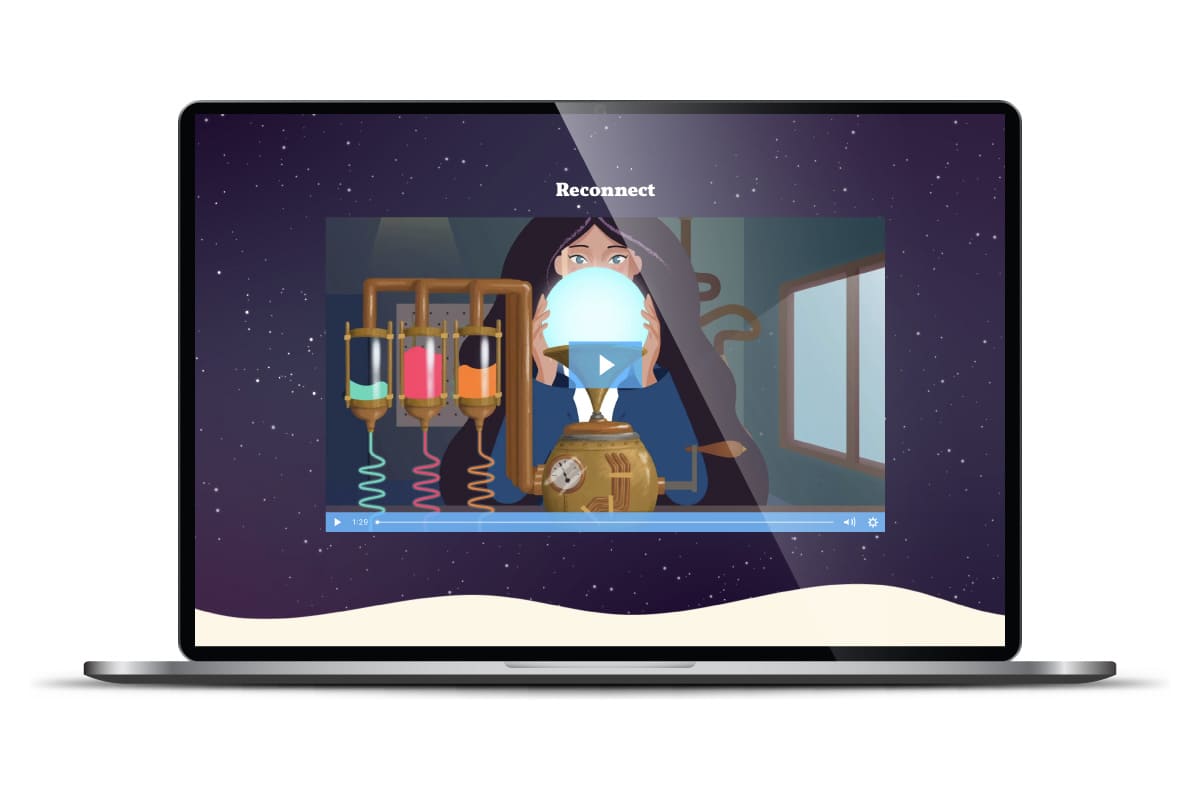
 Video supports learning by using visual and audio cues to aid understanding and increasing engagement
Many of us will say “I am a visual learner” or “I am an auditory learner”, however, this is widely considered to be a myth. Research has shown that, although we might have learning preferences, everyone learns better when given content in a variety of modes, or what is sometimes called a multimodal approach. This is where graphic design can play a vital role in developing greater understanding for learners. When coupled with text, video, or audio - clear graphs, infographics and demonstrative imagery will provide far greater clarity.
.png) An image, in conjunction with written information, allows greater understanding of the topic.
An image, in conjunction with written information, allows greater understanding of the topic.
 Here we created an on scroll animation to explain a very complex process around cyber security
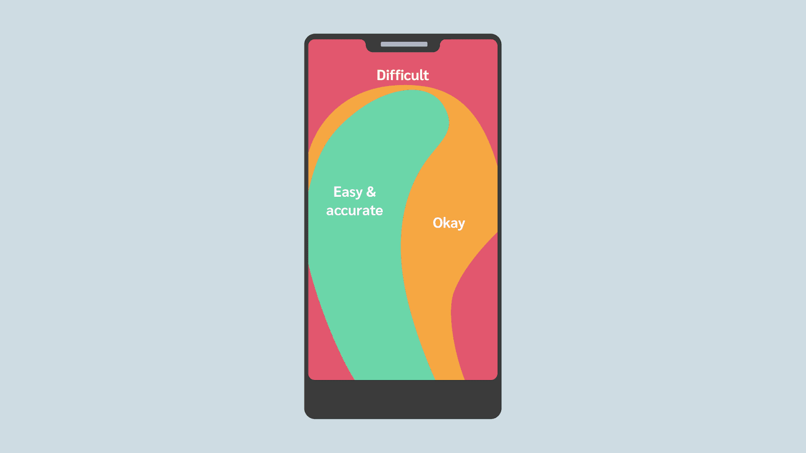
Easy doesn’t mean the content is easy, it means the UI design doesn’t get in the way. This is a key function of UI design principles. For example, where do you place a button on a mobile UI so you can easily reach it with your thumb? Is the text too hard to read? Is it easy to miss content or is it just not clear what I’m supposed to do next? Good design will explain what you need to do. With great design you know without being told - it speaks for itself.
 Thumb reach for mobile UI design
Graphic design often feels like the icing on the cake for many projects, however, it’s an important ingredient in online courses that provides an additional mode of learning that is not just decorative. Good design increases understanding, supports learning, and improves engagement. It really is a vital part of a well rounded, well designed, multi-modal course.
%20(2)%20(1).png)

Gulping Geese and Good Learning Instructional design is the complex interplay between the instructor, the learner, and the medium that supports...

Best practices for LinkedIn job ads underscore the significance of clear job titles, engaging summaries, and targeted audience strategies to...

In today’s fast-paced, digitally-driven business world, companies are increasingly adopting Learning Management Systems (LMS) to streamline employee...

Follow our monthly product updates as we share the latest features to help you strategically design and develop teams and the work environment.

1 min read
“You don’t have people problems until you get HR”. Ouch! Can you believe that I've heard this from some business owners and execs? Let's shine a...